A Tour of the Office
It's late in the afternoon, it's Thursday, and I'm leaving tomorrow morning for a 4-day vacation over the Memorial day weekend. Therefore, it seemed good to me to leave everyone with a huge post about the shortcomings of the most popular office supply store websites currently on the web!
Seriously, though, this is a post about web usability. I was flabbergasted yesterday when I set out to buy a few phone accessories for my office - these office websites are so unbelievable hard to use! In fact, my experience was so dissatisfying that I ended up going to Google and finding a completely random online store - www.golinuxshop.com. This website gets my vote, and will also get my repeat business, as it was immensely easy to use, and served up prices that I couldn't beat anywhere else. Prices aside, though, if someone else had been easier to use , I might have never found the deals I did at www.golinuxshop.com.
To start, I was looking for some very common phone accessories - some phone line couplers (female/female), duplex adapters (all female), and triplex adapters (male/female). I thought these ought to be easy to find, since we have tons of them already in the office.
First try - OfficeDepot.com - My first stop was the place where we already have an account. To start, let's take a look at the top menu bar:

Hmmm... Now, how do I know where to look? I'm looking for phone line adapters. Are they "office supplies"? Are they "technology"? I do know that they're not "furniture", but that's about it. So, I go to the search bar.

This is a reasonably usable web search bar, where you don't have to tell the website which categories to search through - it just figures that out for you. However, after multiple searches, I became convinced that Office Depot online did not have exactly what I wanted, and so I was obliged to go elsewhere.
Second try - RadioShack.com - Now, I know you're probably thinking what I was thinking at this point - "Surely Radio Shack carries everything I need." However, when I get to their website, I'm greeted by several problems.
Let's take a look at the top menu bar. My, this would be a hard decision, if I were to try and navigate to my product, or sub-category, from the options on the top bar. They've got one choice for "Phones & Radio Communications", and another called "Cables, Parts, & Connectors". Which one is most likely to have adapters for my phone cables?
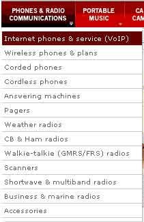
I didn't know, but I figured that I would find out if I just quickly moused over each option to see the sub-categories that slide out below. Here are the options for "Phones & Radio Communications":
And for Cables & Connectors:
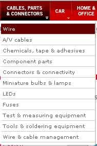
When I was first viewing the menus, nothing from the "Phones" menu made it obvious to me that my adapters would be there, even though that was where I thought they should be. When viewing the second menu, I've got 2 choices that all seem like they could be good places to look for my adapters - "Wire & cable management", and "Connectors & connectivity". However, my feeling is that neither one of these is what I want, so I just decide to search for the thing, which is what most people would probably do anyway. That's when I happened upon the bar:
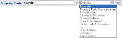
There's just too many questions here, as there were with the menu bar. Do I search in a category? The Entire site? Of course, I chose the entire site, but I still think you should not give the user so many search options from the home page, unless the options are all obviously diverse. I believe that by this demonstration so far I've shown that they aren't.
I then typed my search phrase, [duplex phone adapters], into the box, and it showed me something that was similar, but not exactly what I wanted:
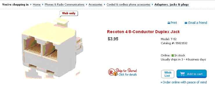
Focus your attention on the bread crumbs at the top of the image: "You're shopping in: Home>Phones & Communication>Accessories>Corded & Cordless Phone Accessories>Adapters, Jacks & Plugs". Perhaps it seems intuitive now, but it certainly didn't upon my first visit to the site. Why should adapters be buried underneath 5 layers of categories, when Radio Shack is the go-to for the world's "adapter" needs? Anyway, it wasn't exactly what I wanted, so I decided to move on to Staples.com. Big mistake.
Third Try - Staples.com - This was the worst office website I had ever seen. Just look at the screenshot:
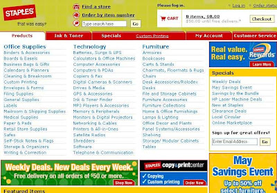
It looks like advertising. The site's content looks like advertising. It's just a bunch of links, with no pictures, and very little explanatory text. The search bar is obscured of its small size and the business of the page.
I'm not even going to try to figure out which category to pick, because it would take too long to look through the long list. However, I did notice the fact that "Ink & toner" has made it to the top, next to "Products". I know some usability specialist must have charged Staples big bucks to tell them that "Ink & toner" is the one thing people visit the website for, but it seems like overkill to me. Actually, it makes Ink and toner the ONLY easy thing to find on the entire website.
But then, I enter a search term, and it asks me for my zip code. Is this really necessary? Radio Shack doesn't need to do that! I realize why they do it, but it seems like the site would be much improved if they could ask for such information at a later time. At this point, they can't be sure someone is actually going to buy - the visitor may be a simple casual browser.
Success! - I'll go ahead and end this long rant, and say I found what I was looking for at GoLinuxShop. It seems like an odd place, and I didn't even know it existed, but it popped up on the Google SERP, and I happend to find exactly what I wanted. Just look at the screenshot:
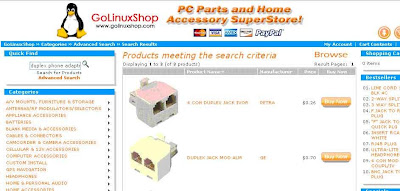
This is the product SERP, but except for the contents of the center block, it is exactly the same as the home page. The list of categories is a bit long, but the subtitle of the website tells you that the site is for selling computer parts and accessories, which makes you expect a pretty specific list of categories. The images are large, and the descriptions are very brief but informative, making the site very easy to use. The search bar is intuitively placed in the top left corner of the content area. The only better place would be right in the center of the page, but then they wouldn't have room for products.
So, I guess the moral of this story is that the big guys certainly don't have it all figured out. Especially with the "Easy Button" campaign that Staples has been touting, it seems like they are content to throw money at the market and expect customers to come streaming in. I also think there's a failure to recognize that marketing products on the internet is necessarily different from marketing products in a building - especially for Staples (i.e., the whole zip code thing, which is actually an issue at the Office Depot website as well). The internet is international, and people who visit the website do not want to go to the store (unless they're looking for the store locator, in which case they're not going to buy things from the website). Throwing money at web marketing problems doesn't usually work, unless the money hires a usability expert who knows his stuff.
Labels: product reviews, web usability
posted by J Trousdale @ 5/24/2007 04:20:00 PM
![]()
![]()


1 Comments:
It seems to be the trend to throw everything and the kitchen sink on a retailers homepage rather than give some thought and logic to the online shopping process.
Post a Comment
Subscribe to Post Comments [Atom]
<< Home