Search Novice

We're all searching for something.

15 October 2007

Target Accessibility Case Could Be A Gain For Usability

I just read an interesting article at the SEWatch blog:

SearchEngineWatch: Don't Ignore Accessibility

The article is specifically about the class-action lawsuit that has been brought against Target stores by the National Federation for the Blind. Apparently, Target's website is not fully accessible to blind users, and so Target is getting sued because this oversight violates California laws protecting people with disabilities.

Most webmasters out there know that there are things you can do to make your website accessible to blind users. Proper CSS formatting, along with proper separation of content from design in each page is all part of the process. However, doing these things will not only allow your site to be accessible to blind users, but will also allow you to make many Web 2.0-type features available on your site easily.

My hope is that better accessibility across the board will also give basic usability a boast. Perhaps we will see some quasi standards evolve for usability aspects of a site - and perhaps we will see the already existing standards become more concrete.

Labels:

25 September 2007

The Changing Amazon

I'm sure I'm the last to notice this, but it looks like Amazon.com has done a pretty extensive redesign of their site. The ultimate useful site from the popular design book Don't Make Me Think! has made a major change to the tab-driven design that originally made the site so easy to navigate. They do acknowledge that their difficulty in designing their sight in a usable way stems from their expansion to over 40 categories of goods sold on their site. The new site, still in a testing, or beta, phase, does away with the old all-tabbed navigation and opts for a tidy pull-down menu.

I did take 2 minutes to look at the source code of the navigation elements of the pages, and it looks like a pure CSS and JavaScript pop-down menu. All of the elements are always present, and JavaScript changes the display attributes on mouse events. I'm sure you get the picture without me explaining it. In case you're interested, here's a cool example of a menu you can create with CSS and JavaScript.

We'll see how this affects Amazon's status as the most usable major Marketplace website out there. What will their customers and partners think?

Labels:

13 September 2007

All That Shift

The Online News Shift and Hyperlocal Content | Searchviews

A very interesting development - the LA Times, one of the big-time players in print media, is planning to eventually become a primarily online news source. This is at the expense of their print business. Seeing that the future of news will be in so-called hyperlocal content and other online media, they are saying that their print publication will eventually shrink considerably. This comes as some have labeled the newspaper as "web-stupid", possibly a very telling designation for our times.

I'll write more later - it's late, and I'm busy.

Labels:

12 September 2007

People at SuperPages / Idearc Read This Blog!

I just thought this was cool, so I decided to post about it...

After my morning rant about Superpages, I was surprised (shouldn't have been) to find evidence in my server logs that I was briefly showing up in searches involving the keyword "superpages".

However, I was also surprised to see that the people clicking through to this blog did so from the Idearc offices in Dallas, Texas.

[The screenshot of my analytics software, showing the ISP and location of this user, has been removed. I decided that was a little much.]

So, maybe that means that they'll change the entire layout and architecture of their website because of my previous post. Right.

Labels: , ,

Superpages Keeps Making Me Think!

Superpages Acquires 'LocalSearch.com' Domain - SE Land

Interestingly, Superpages has purchased another locally-focused domain name. Superpages is interested in branching out, but I would like to see them do more for the discipline of vertical search.

In its present interface, Superpages, like YellowBook, does not do much for you that a plain old paper edition of the Yellow Pages can't. Whether you use Advanced Search or the plain old search bar at the top of the page, you are not taken directly to the businesses you want. I put in [HVAC repair] in my city, and was pointed to a list of categories that would "refine my search". There are 109 businesses listed for "Heating & Air Conditioning Service & Repair", but only 99 listed for "Air Conditioning Service & Repair". Aren't those the same thing? Are businesses cross-listed, or did the website somehow separate the two categories?

There are far too many questions here. Don't make me think!

Anyway, since it's 100 degrees outside, I'm not to keen on the category that begins with "Heating", so I click the second choice. Behold I have a list of contractors. But where do I click? The business names are red, italicized font, with no click-ability. That seems like it would be the place you would want people to click. However, the "Click Here" is hiding over to the right.

Then, after further inspection, I realize the "names" are actually titles chosen by each company. They're not actually business names, but rather catch phrases that are supposed to make me notice each one individually. What tipped me off? I noticed that "Home Cooling Estimates" looked like a pretty weird business name.

And then, lo and behold, some "business names" actually are click-able.

Evidently, usability is not the name of the game here.

Labels: , ,

06 September 2007

How Search Engines Will Grow

SEOmoz | Where are Search Engines Most Likely To Innovate?

Above is a very quick and interesting look at how search engines might change and grow over the coming years, posted by Rand over at SEOmoz.

Personally, I see vertical search as the area with potential that has been developed the least, and therefore has the most potential for growth. I say this with sites like Magicyellow.com, Yellowbook.com, and ServiceMagic.com in mind, because these are the big players in the game of "who-ya-gonna-call" in the online world. These are the cats throwing the most money into offline advertising and branding, in efforts to push people onto their sites and use their listings.

Basically, these sites are also the reasons that I say the area is under-developed. Case in point: if you need a plumber, and you want to find one online, these days you go to Magicyellow or Yellowbook (or place your own home-service-related website here). You plug "plumbers" into the search box, along with a location, and press Enter, and you are given a results page that has a long list of plumber-related services.

Sidenote: if you're on Magicyellow, you're only given a list of the categories that most closely match your search. Do you want "plumbers" or "Plumbing Drain & Sewer Cleaning"? Will one give you better results because it sounds more specific? Are they really different categories, or just different names listed for the same group of businesses? In spite of the poor interface, I click on "plumbers"... and get a page full of ads! What's the difference between "Premier Advertisers", "Preferred Advertisers", "Sponsored Listings", and "Courtesy Listings"? Did the courtesy listings people pay to get their business listed, or are they provided as a "courtesy" of some sort?

Anyway, when you do get to the list of plumbers, there is no added value - the experience gives you the same benefit as looking up plumbers in the phone book (on paper!). There's a list of companies, and you still have no idea which is best for you. As I said, you might as well just open the phone book.

And don't get me started on sites like ServiceMagic. Here, you don't even get to look at the list - you have to submit your personal information into cyberspace, then wait while the website contacts plumbers "for you". Are you kidding? That's not the internet! That's not what the internet is supposed to be. I want to pick the service myself! I can be my own 411 - just give me the required information!

More on this later... I'm at work, and this is starting to take up more time than I thought it would.

Labels: , , , ,

17 August 2007

BBC NEWS "Blog" - How not to blog

BBC NEWS | The Editors

I subscribed to the BBC News blog weeks ago, and I really can't find a justifiable reason why. I think I did it mainly because they had a blog, and as I am always reading blogs, I thought it would be good to read one put out by a major news organization that is read by everyone - not just bloggers and SEO geeks (sorry everyone, but that's what we are).

What I ended up with was a bunch of blog entries that I now just gloss over in my feed reader without thinking twice. And why shouldn't I? Does anyone out there actually read the BBC Blog?

For starters, the posts I end up reading have very descriptive titles. That's what I need to get me interested, especially when I have 100 new posts to sort through every day!

Take, for instance, this title from SELand:

AOL's Truveo Introduces New Video Search Site And Consumer Destination


What do you think this post is about? It's a stupid question - the subject is in the title. Now, look at this title from the BBC:

Setting up camp

What is this about? After reading the first paragraph, I'm still not sure. This is how it starts off:
It’s a pretty quiet period for news at the moment - fairly normal for August though - and sometimes it can be a bit of a struggle to find enough stories from around the UK.
It turns out that the post is about climate change protesters setting up camp near Heathrow Airport. What's more, it doesn't say much, besides the admission that there aren't many stories around, and so they're just writing about things people can see from their office window.

And even more than that, only the first 2 lines of the post were visible in my feed reader! Why am I going to go out of my way, click on the feed, open it in another window, and read to the middle of the post, just to figure out what the thing is about?

Here's the lesson for bloggers - learn from my inadvertent behavior.
  • Make your titles descriptive and specific.
  • Subscribe to your own feed so that you know what it looks like in a feed reader.
  • Make sure people can read enough of each post in a reader to grab their interest.
  • And... write about interesting stuff - don't just write to be writing!

Labels: ,

16 August 2007

Where do you find a good plumber?

MagicYellow online Yellow Pages

Has anyone actually used MagicYellow.com? Basically, it's the phone book online. It's a bunch of companies that said, "hey, Mr. Yellow, let me be in your book. Here's $5." Basically, the point is that there is no quality control to these kinds of sites. There's also ServiceMagic.com, FindaContractor.com, and a handful of other websites that generate leads for the average contractor.

To the contractor, it's a risk, but not a high one. ServiceMagic sells leads in groups of 10, 20, or more per month, and the contractor simply pays a fixed fee.

For the consumer, the service is marketed as a way to find "pre-screened" contractors to work in your home, but in actuality, there's nothing "magic" about the service providers. They are just the ones that were good enough to pay ServiceMagic for the placement on the website.

So, again, where do you find a good plumber? The answer is, we don't know. At least, as far as the internet is concerned, we don't know. Nobody is taking full advantage of the abilities of vertical search or Web 3.0 in this realm on a large scale.

Essentially, MagicYellow is still in the age of Web 1.0, serving up big lists. There's not much of an algorithm to go with. We've got the resources to do much better than that.

Labels:

Using Vertical Search To Incite Market Upheaval

I was talking with a friend last night about ways to change marketplaces for the better, and we talked for a while about vertical search, and the potential to bring organization to disaggregated industries. How do I find a good web designer? There isn't a plethora of options. However, with the right website and programming, there could be a system that would bring the right person to your door (or to your phone) in a matter of a few minutes and a few clicks of the mouse.

I don't have that much time to write now, so this is it for now, but I will write more soon...

Labels: ,

07 August 2007

SEW Blog's Response to Matt Cutts's Blog...

SearchEngineWatch Blog: Google Indexing Near Real Time

Here is SEW's response to Cutts's post about real-time indexing on Google's spidering. It is very interesting as well, and points out that we need to remember that Cutts's post relates just to indexing and not necessarily to ranking. Rankings will change over time. However, indexing - according to Google - ought to happen real-time in the not-so-distant future.

It's not Big Brother, but it is Google helping create a more usable internet.

Labels: ,

06 August 2007

ConverStations: Facebook vs LinkedIn

ConverStations: Facebook vs LinkedIn

A very interesting post by Mike over at Converstations. I forgot to put this blog on my feed reader, after finding it interesting enough to put on my blogroll (to the right side of the page). I finally did put it on my feed reader, and I suggest you do the same. Mike is keen on blogging, especially for business purposes, as a way to create an ongoing dialog with the public.

Anyway, Facebook is an excellent online community for people to be plugged into. I finally took the Facebook plunge for myself about 2 months ago, and I am very happy with the site. I agree with Mike that opening up the platform to outside developers might be Facebook's trump card over other communities like LinkedIn.

Labels:

04 June 2007

Purpose of Bread Crumbs


This post is basically a "c'mon, people!" post.

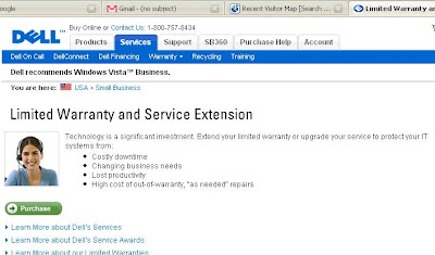
Above we have a screenshot of Dell's page for purchasing Limited Warranty and Service Extensions - a page that you would think Dell wants to be highly accessible for Dell computer users. Today I was there, trying to find the page where I could purchase a warranty extension for our company's server.

After about 20 minutes of fruitless clicking around the Dell website, it was only by going to Google's incredibly useful Web History feature that I was able to finally find the pages I was looking for. I ran a search in my history for [Dell warranty], and was able to find the path I had followed last week.

However, after looking at the Dell page I found, I thought, "no wonder!" Look at the bread crumbs:

You are here: USA > Small Business

I could have been anywhere in the Dell Small Business portal!

Dell is using a common device known as "bread crumbs" to help users navigate through the site. But here is the problem: BREAD CRUMBS ARE USEFUL ONLY IF THEY ACTUALLY HELP SOMEONE FIND OUT WHERE THEY ARE IN THE SITE!

You students of web usability out there may be able to give an even better solution than this, but here's my suggestion for an alternative bread crumb system:

You are here: Small Business Services > Service & Warranties > Warranty Extensions

Some other thoughts on bread crumbs, with Dell specifically in mind...

  • The presence of "USA" in the bread crumb trail is of absolutely zero use to me as an American user. I'm betting that the case would be the same for a UK user viewing the UK Dell website. Perhaps the webpages could display the American flag elsewhere, with some statement like, "This is the Dell USA website. Click here for another country." Imagine that for usability.
  • I understand the presence of the "Small Business" designation, but as it is currently, this is also of zero use to me, as a small business user. More descriptive classifications would greatly help the usability of the website. For example, is there a need for separation of "small business products" from "small business services"?
  • Besides the issue of bread crumbs, there is the issue of making the account homepage more useful. Granted, there is probably some way in which my company could have used the Dell website in the past that would have made it easier for me to find the computer in question and purchase the needed services. But it is also likely that doing so was not obviously useful enough to go through the necessary steps. It's got to be obvious for us! Dell, you've got the time and the people - give us a website devoted to current accounts. Make it all-inclusive for us, like a bank website, so that it's obviously the place where we view ALL of our past Dell purchases, make new purchases, and manage our warranties. Dell ought to be able to use computers just as well as banks can.
Those are my thoughts. If Dell disagrees, well, then... they're wrong.

Labels:

02 June 2007

The Value of PageRank

Paul Barrett's post at Apple Pie & Custard about Google PageRank:
http://www.sitevisibility.co.uk/2006/10/google-page-rank-update.html

It's early, so I figured I'd comment on this article, since it's short and to the point, and commenting on it would not take too long. PageRank is something that has baffled me for a while, as another one of those things in the field of SEO that is good to have, but is not exactly essential to good visibility. The crazy thing is, we know that it is part of the mix somehow, but we don't really know exactly how - it just another one of those weird puzzle pieces to SEO. We know it fits, but we don't always know just where. For example, the Google blogger page that I'm using to write this post has a PageRank of 7, but each page in my website at work a PageRank of 3, even though the site hundreds of pages of content, all interlinked, with several inbound links from outside sources. We've never been able to raise the PageRank, even though I've been able to increase in SERPs considerably over the past year.

So, I guess I'm just saying that I wish there was an A+B=C equation in this business for something, mostly so that I could go show my boss something that is certain, and he could say, "well, I'm glad you found that out..," or something like that.

That's my ramble for the morning. Enjoy.

Labels: , , ,

24 May 2007

A Tour of the Office

It's late in the afternoon, it's Thursday, and I'm leaving tomorrow morning for a 4-day vacation over the Memorial day weekend. Therefore, it seemed good to me to leave everyone with a huge post about the shortcomings of the most popular office supply store websites currently on the web!

Seriously, though, this is a post about web usability. I was flabbergasted yesterday when I set out to buy a few phone accessories for my office - these office websites are so unbelievable hard to use! In fact, my experience was so dissatisfying that I ended up going to Google and finding a completely random online store - www.golinuxshop.com. This website gets my vote, and will also get my repeat business, as it was immensely easy to use, and served up prices that I couldn't beat anywhere else. Prices aside, though, if someone else had been easier to use , I might have never found the deals I did at www.golinuxshop.com.

To start, I was looking for some very common phone accessories - some phone line couplers (female/female), duplex adapters (all female), and triplex adapters (male/female). I thought these ought to be easy to find, since we have tons of them already in the office.

First try - OfficeDepot.com - My first stop was the place where we already have an account. To start, let's take a look at the top menu bar:



Hmmm... Now, how do I know where to look? I'm looking for phone line adapters. Are they "office supplies"? Are they "technology"? I do know that they're not "furniture", but that's about it. So, I go to the search bar.



This is a reasonably usable web search bar, where you don't have to tell the website which categories to search through - it just figures that out for you. However, after multiple searches, I became convinced that Office Depot online did not have exactly what I wanted, and so I was obliged to go elsewhere.

Second try - RadioShack.com - Now, I know you're probably thinking what I was thinking at this point - "Surely Radio Shack carries everything I need." However, when I get to their website, I'm greeted by several problems.

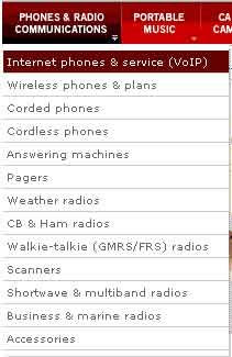
Let's take a look at the top menu bar. My, this would be a hard decision, if I were to try and navigate to my product, or sub-category, from the options on the top bar. They've got one choice for "Phones & Radio Communications", and another called "Cables, Parts, & Connectors". Which one is most likely to have adapters for my phone cables?

I didn't know, but I figured that I would find out if I just quickly moused over each option to see the sub-categories that slide out below. Here are the options for "Phones & Radio Communications":


And for Cables & Connectors:
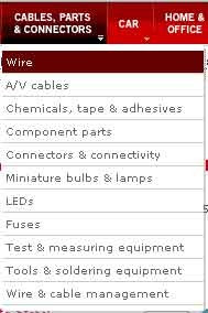


When I was first viewing the menus, nothing from the "Phones" menu made it obvious to me that my adapters would be there, even though that was where I thought they should be. When viewing the second menu, I've got 2 choices that all seem like they could be good places to look for my adapters - "Wire & cable management", and "Connectors & connectivity". However, my feeling is that neither one of these is what I want, so I just decide to search for the thing, which is what most people would probably do anyway. That's when I happened upon the bar:
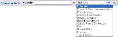


There's just too many questions here, as there were with the menu bar. Do I search in a category? The Entire site? Of course, I chose the entire site, but I still think you should not give the user so many search options from the home page, unless the options are all obviously diverse. I believe that by this demonstration so far I've shown that they aren't.

I then typed my search phrase, [duplex phone adapters], into the box, and it showed me something that was similar, but not exactly what I wanted:
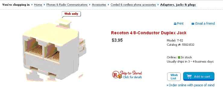


Focus your attention on the bread crumbs at the top of the image: "You're shopping in: Home>Phones & Communication>Accessories>Corded & Cordless Phone Accessories>Adapters, Jacks & Plugs". Perhaps it seems intuitive now, but it certainly didn't upon my first visit to the site. Why should adapters be buried underneath 5 layers of categories, when Radio Shack is the go-to for the world's "adapter" needs? Anyway, it wasn't exactly what I wanted, so I decided to move on to Staples.com. Big mistake.

Third Try - Staples.com - This was the worst office website I had ever seen. Just look at the screenshot:
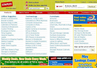

It looks like advertising. The site's content looks like advertising. It's just a bunch of links, with no pictures, and very little explanatory text. The search bar is obscured of its small size and the business of the page.

I'm not even going to try to figure out which category to pick, because it would take too long to look through the long list. However, I did notice the fact that "Ink & toner" has made it to the top, next to "Products". I know some usability specialist must have charged Staples big bucks to tell them that "Ink & toner" is the one thing people visit the website for, but it seems like overkill to me. Actually, it makes Ink and toner the ONLY easy thing to find on the entire website.

But then, I enter a search term, and it asks me for my zip code. Is this really necessary? Radio Shack doesn't need to do that! I realize why they do it, but it seems like the site would be much improved if they could ask for such information at a later time. At this point, they can't be sure someone is actually going to buy - the visitor may be a simple casual browser.

Success! - I'll go ahead and end this long rant, and say I found what I was looking for at GoLinuxShop. It seems like an odd place, and I didn't even know it existed, but it popped up on the Google SERP, and I happend to find exactly what I wanted. Just look at the screenshot:
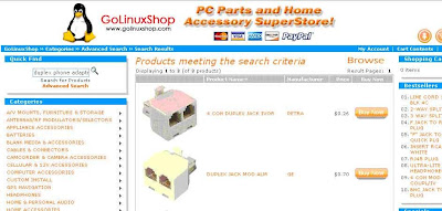


This is the product SERP, but except for the contents of the center block, it is exactly the same as the home page. The list of categories is a bit long, but the subtitle of the website tells you that the site is for selling computer parts and accessories, which makes you expect a pretty specific list of categories. The images are large, and the descriptions are very brief but informative, making the site very easy to use. The search bar is intuitively placed in the top left corner of the content area. The only better place would be right in the center of the page, but then they wouldn't have room for products.

So, I guess the moral of this story is that the big guys certainly don't have it all figured out. Especially with the "Easy Button" campaign that Staples has been touting, it seems like they are content to throw money at the market and expect customers to come streaming in. I also think there's a failure to recognize that marketing products on the internet is necessarily different from marketing products in a building - especially for Staples (i.e., the whole zip code thing, which is actually an issue at the Office Depot website as well). The internet is international, and people who visit the website do not want to go to the store (unless they're looking for the store locator, in which case they're not going to buy things from the website). Throwing money at web marketing problems doesn't usually work, unless the money hires a usability expert who knows his stuff.

Labels: ,

22 May 2007

A few words about NOFOLLOW

The current post over at search engine master DaveN’s blog has a few words about the NOFOLLOW tag, which are actually more questions than opinions or answers. The great NOFOLLOW initiative, begun about 2 and a half years ago by the big three, has left us all with little more than great questions in general, in addition to a little tag that we can put in our website’s link structure if we want. We’re not sure if it works, we’re not sure exactly how it works. Since the SEO industry is in general behind a great cloud of uncertainty that separates the royals (the googlers) from the peasants (the rest of us), as usual, the original statement of intent from Google was not specific enough to sufficiently describe how the tool is really used. In my opinion, the addition of the NOFOLLOW attribute (sorry if I called it a tag earlier), has added much more uncertainty than functionality to an industry of SEO consultants who are already dealing with considerable uncertainty because of the sheer nature of SEO.

Here are a few issues that we don’t really know:

1. If you use a NOFOLLOW link, we know that the link does not contribute to the recipient’s PR. BUT does the link actually count against the recipient? In other words, is a NOFOLLOW vote actually lowering PR of the recipient?

2. Does NOFOLLOW have any affect on the referrer? If I were ranking a page, and I saw that it had a bunch of links to bad pages (signified by the presence of NOFOLLOW), I would not want to rank the referring page highly. Who wants to see a page with a bunch of links for which it has no confidence?

3. What if NOFOLLOW is used within the link structure of the same website? Can a website drive PR to certain pages by using NOFOLLOW in links to less profitable content?

We actually used #3 at my company, before my tenure here, and I convinced everyone that this was not a good idea, since we don’t have definitive answers to #1 or #2. I felt that we were issuing votes of “no confidence” to ourselves by following this strategy, thereby hurting ourselves in the eyes of Google. In addition to this, I didn’t see the same strategy at work anywhere else on the web, which further eroded my confidence in it.

Personally, I wish that NOFOLLOW had never been devised, or that it had been devised completely differently. The device has added, in my opinion, just one more list of questions for which the SEO crowd doesn’t really have answers.

Labels: , ,

10 May 2007

New Earth-blog at Google

From Search Engine Watch Blog...
Google Launches New "Geo" Blog

This seems like a great opportunity for search to expand, and to me seems like a completely new frontier of technology, even. I also think that this is a huge opportunity for Open Source to show us why open collaboration is far superior to the monopoly-and-copyright approach to web and software development. While it is not really producing true "open source" software, Google genuinely promotes the open source movement by opening up its software APIs to the rest of the world. It also promotes the flow of open source by not charging a penny for the use of the software. They do stake a claim on the authorship of that software, but their claim doesn't cost me several hundred dollars per computer per year, like it does with some other companies. (Yes, that was a NOFOLLOW link.)

Again, I am making a play on the "striving" theme. This is definitely something where we will be always striving, never arriving. I don't really think the Web-Earth project will ever "arrive," in the sense that everyone will be satisfied, all at the same time, causing development to cease for a time until we all have holographic computers that display an actual globe in front of us, and then we work on Web Earth 2.1, or "XP". I don't think the striving of the entire community of developers can be held inside of one company - nor can the desires and needs of the world be met by one community of developers. And that's why open source (combined with "Google source") will be the ones to "win" this war by fighting the true fight.

Labels: , , ,