Search Novice

We're all searching for something.

26 February 2008

Pandora Rocks, Apple Scrooge, and Other Thoughts...

I know - it's been almost 3 weeks since my last post. OK. I know, I'm an SEO junkie, and I ought to know how detrimental this is to my blog's prospects for visibility. But, alas, as I have failed so far in my attempts to make this blog into a net money-maker, my time has been used up with more profitable ventures.

Back to blogging, I must take a short minute and say something about one of the things I like. Pandora is amazing; if you've never tried it, take a quick detour right now (and then come back). If you don't know what Pandora is yet, just think "Internet radio" - except much, much better than our normal concepts of radio. The site is so user-friendly that spending any more time explaining it would be overkill.

Now for today's first news item: Apple’s cash: It’s one sour cider - Financial Week

It seems Apple is following a troubling cycle, and it goes like this:

  1. endure steady, light criticism from tech blogs everywhere for several months;

  2. announce an upcoming product release; ride an incredible wave of rising hype as the release date draws nigh;

  3. reap big profits from initial sales;

  4. endure steady criticism about the new product's shortcomings.
So, it appears we're in the interim period between #4 and #1, a familiar "dead zone", where Apple can't seem to do anything right, and we all wonder about the merits of their closed model of production.

Labels: , ,

29 January 2008

Falling Far From the Tree

----------


Fortune - Apple's $300 Million Gray Market Dilemma
AppleInsider - Steve Jobs to Apple investors: 'hang in there'
Gizmodo - First Proof Apple Making Near Zero on AppleTV (And Big Bucks on iTunes)


Looking out on the tech world today, I see one article about slashed prices on one big Apple product, another article about a gray market problem on another big Apple product (and possible slashed prices in the future), and a "please let us keep your money" letter from Steve Jobs. This Apple is falling far from the tree lately.

For a company that is supposedly on the cutting edge of consumer tech, there have been so many obvious features omitted from several products debuted in recent years.

It's no stretch to assume that these missteps have indirectly contributed to the recent free-fall of Apple's stock price, down $65/share (roughly 32%) over the last month.

The point I'm trying to make is that, while Apple and Jobs seem to be laden with an uncanny sense for creating those gadgets that consumers didn't even know they needed, there have been surprising oversights in their product releases. Too many popular, and sometimes necessary, features have been missing on their new products. These latest stories about subsidizing Apple TV and gray market iPhones seem to be pointing to one idea - Apple either has to shape up and read the tea leaves better before releasing new products, or they must embrace a more open model of production. The current closed model seems to make every move too much of a make-or-break moment - it's too risky. It may still survive for a while to come, but in order for that to happen, Apple's got to put better features on it's "it" products.

Labels: , ,

09 August 2007

Welcome to Virgin America

Welcome to Virgin America

The newest American air line is here - it's Virgin America, which has started operations on this side of the pond, with its first hub at San Fran.

Anyway, they've got a cool website. I definitely like the flash video on the homepage. Very easy, and very inviting. I almost wish I lived in San Fransisco or LA.

Labels:

28 July 2007

Updates to my favorite travel search engine

About Kayak.com

I just wanted to give some notoriety (and link juice, not that it means anything coming from my little blog) to my favorite travel search engine, Kayak.com, because they have recently updated their website, adding some very good improvements.

This is a site which I check regularly to see if it would make any sense to start planning that vacation to... wherever. The site has been updated with new "Matrix" and "Chart" views for search results, and the SERPs have received some graphical tightening. It looks great, and all the old functionality that drew me to the site in the first place is still there.

The attraction of Kayak.com is that you can use this one website to search for low fares across all the major travel websites (Orbitz, Expedia, Cheaptickets, etc.). Just query a destination and date, and it will search all of those engines for you at once. Very convenient.

So, if you're planning your next trip, I would say go to Kayak.com.

Labels:

23 July 2007

Google Wireless Phone

Google Wireless Phone

Dan Horton just posted about the coming Google Wireless Phone on DaveN's blog. Good post. And, I must add, Dan seems to be a much better writer than DaveN himself. I mean, Dave... c'mon. It makes you look bad when you use such bad grammar. Your sentences often don't even make sense.

Anyway, so Google might put out a phone that will finally liberate us from the wireless tyrants (ATT, Verizon, Sprint). I mean, nobody gets a good deal from these companies, and they all tailor their software specifically so that you'll have to buy more features on your monthly plan in order to do the things that would make your cell phone really useful. Like... send SMSs to your email box.

Anyway, Go Google! Great post on DaveN's blog.
JT


-

Labels: ,

26 June 2007

Give us a Google Map, Google!

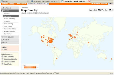
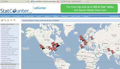
This is just a quick post to recognize a glaring shortcoming in the new (and old, for that matter) Google Analytics. Weeks ago, on the spur of the moment I decided to use both Google Analytics and Statcounter, another free analytics service, to track visitors on this blog. One feature I enjoy thoroughly is the visitor map, which displays the locations of visitors on... a map.

Here's the Google version of the visitor map:


And here's the Statcounter one:


Notice that the Statcounter version is actually a Google Map! However, Google is for some reason incapable of allowing us to use the very functionality that they created! Statcounter's version is a Google map, and therefore has most of the functionality of the Google map service. The Google Analytics version, however, is useless by comparison, as it has none of this functionality. There's no zooming in, no satellite photos, and no click-and-drag of the map. What is this?!

This is all said with a certain amount of surprise, given Google's apparent commitment to innovation and excellence. I would bet that a Google map feature will be available sometime in the near future within the Analytics service. It's probably just a matter of time. Such an addition would greatly improve any already useful analytics service.

Labels: , ,

13 June 2007

Even the Little Guys Can Influence The World of SEO

Google Updates Analytics

I just wanted to point out, as I've seen everyone else already do, that Google has again updated Analytics, this time adding a feature that I called for on this blog several weeks ago: quicker reporting.

I think this is an indicator that anyone can have an effect on those big giants of the internet game - even little guys like me, trying things out and then blogging about what they like and don't like. Honestly, though, this is probably the result of hundreds of hours of review and development on Google's side, since they seem to be just as perfectionistic (is that a word?) as the rest of us. This is a great improvement.

The other great improvements in this new edition of Google Analytics are clickable URLs and the ability to cross-segment reports by network location. This adds a lot of functionality to the already redesigned interface, making it even better than before.

However, some questions have been raised about the entire Analytics service, and why in the world it has been offered for free. I will be blogging about this very interesting caveat soon.

Labels: , ,

06 June 2007

Ask.com: The better marketer

Take a look:

ClickZ News - Yahoo Shows Off Panama
PC World - Yahoo Opens Access to Panama
SEW Blog - Ask.com: The Other Search Engine

Does anyone see a dichotomy here? What we have is a whole bunch of people that want to throw Google off of their thrown. We've got different news stories, all asking the question, "Is this going to be the thing that enables [Insert Company Name] to catch up with Google?"

However, the story about Ask.com is very interesting, because it shows a company that seems to be openly embracing its standing in the marketplace, behind Google and the other search engines out there. They're not content with their standing, but in order to move up in the world of search, they are openly acknowledging that they are not number one, or even number two for that matter. Perhaps this line of thinking will help them better identify with the majority of users out there, who also designated Google as the SE to beat. Ask.com seems to further feed this line of thinking by advertising on YouTube, a Google-owned property.

Yahoo, on the other hand, like Microsoft, is continuing with the more traditional approach of pointing people to itself as the best search engine out there. Of course - why wouldn't they want people to think they are the best? The problem with that is, most people don't. They've got a larger network, perhaps more tools, and a different ad platform now, but everyone still says Google is better. That perception doesn't seem to be changing soon, either.

This is all to say that, while Yahoo and Microsoft seem to be taking the old, traditional approach to marketing themselves, it doesn't seem to be working, and Ask.com's approach seems to be more in line with the users out there.

Labels: , , ,

24 May 2007

A Tour of the Office

It's late in the afternoon, it's Thursday, and I'm leaving tomorrow morning for a 4-day vacation over the Memorial day weekend. Therefore, it seemed good to me to leave everyone with a huge post about the shortcomings of the most popular office supply store websites currently on the web!

Seriously, though, this is a post about web usability. I was flabbergasted yesterday when I set out to buy a few phone accessories for my office - these office websites are so unbelievable hard to use! In fact, my experience was so dissatisfying that I ended up going to Google and finding a completely random online store - www.golinuxshop.com. This website gets my vote, and will also get my repeat business, as it was immensely easy to use, and served up prices that I couldn't beat anywhere else. Prices aside, though, if someone else had been easier to use , I might have never found the deals I did at www.golinuxshop.com.

To start, I was looking for some very common phone accessories - some phone line couplers (female/female), duplex adapters (all female), and triplex adapters (male/female). I thought these ought to be easy to find, since we have tons of them already in the office.

First try - OfficeDepot.com - My first stop was the place where we already have an account. To start, let's take a look at the top menu bar:



Hmmm... Now, how do I know where to look? I'm looking for phone line adapters. Are they "office supplies"? Are they "technology"? I do know that they're not "furniture", but that's about it. So, I go to the search bar.



This is a reasonably usable web search bar, where you don't have to tell the website which categories to search through - it just figures that out for you. However, after multiple searches, I became convinced that Office Depot online did not have exactly what I wanted, and so I was obliged to go elsewhere.

Second try - RadioShack.com - Now, I know you're probably thinking what I was thinking at this point - "Surely Radio Shack carries everything I need." However, when I get to their website, I'm greeted by several problems.

Let's take a look at the top menu bar. My, this would be a hard decision, if I were to try and navigate to my product, or sub-category, from the options on the top bar. They've got one choice for "Phones & Radio Communications", and another called "Cables, Parts, & Connectors". Which one is most likely to have adapters for my phone cables?

I didn't know, but I figured that I would find out if I just quickly moused over each option to see the sub-categories that slide out below. Here are the options for "Phones & Radio Communications":
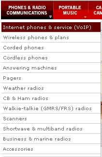


And for Cables & Connectors:



When I was first viewing the menus, nothing from the "Phones" menu made it obvious to me that my adapters would be there, even though that was where I thought they should be. When viewing the second menu, I've got 2 choices that all seem like they could be good places to look for my adapters - "Wire & cable management", and "Connectors & connectivity". However, my feeling is that neither one of these is what I want, so I just decide to search for the thing, which is what most people would probably do anyway. That's when I happened upon the bar:
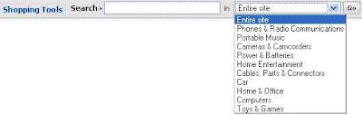


There's just too many questions here, as there were with the menu bar. Do I search in a category? The Entire site? Of course, I chose the entire site, but I still think you should not give the user so many search options from the home page, unless the options are all obviously diverse. I believe that by this demonstration so far I've shown that they aren't.

I then typed my search phrase, [duplex phone adapters], into the box, and it showed me something that was similar, but not exactly what I wanted:
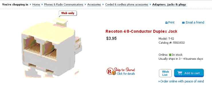


Focus your attention on the bread crumbs at the top of the image: "You're shopping in: Home>Phones & Communication>Accessories>Corded & Cordless Phone Accessories>Adapters, Jacks & Plugs". Perhaps it seems intuitive now, but it certainly didn't upon my first visit to the site. Why should adapters be buried underneath 5 layers of categories, when Radio Shack is the go-to for the world's "adapter" needs? Anyway, it wasn't exactly what I wanted, so I decided to move on to Staples.com. Big mistake.

Third Try - Staples.com - This was the worst office website I had ever seen. Just look at the screenshot:
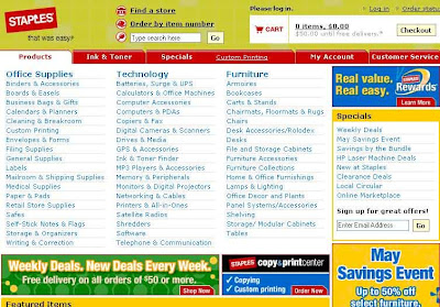

It looks like advertising. The site's content looks like advertising. It's just a bunch of links, with no pictures, and very little explanatory text. The search bar is obscured of its small size and the business of the page.

I'm not even going to try to figure out which category to pick, because it would take too long to look through the long list. However, I did notice the fact that "Ink & toner" has made it to the top, next to "Products". I know some usability specialist must have charged Staples big bucks to tell them that "Ink & toner" is the one thing people visit the website for, but it seems like overkill to me. Actually, it makes Ink and toner the ONLY easy thing to find on the entire website.

But then, I enter a search term, and it asks me for my zip code. Is this really necessary? Radio Shack doesn't need to do that! I realize why they do it, but it seems like the site would be much improved if they could ask for such information at a later time. At this point, they can't be sure someone is actually going to buy - the visitor may be a simple casual browser.

Success! - I'll go ahead and end this long rant, and say I found what I was looking for at GoLinuxShop. It seems like an odd place, and I didn't even know it existed, but it popped up on the Google SERP, and I happend to find exactly what I wanted. Just look at the screenshot:
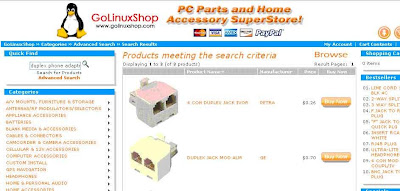


This is the product SERP, but except for the contents of the center block, it is exactly the same as the home page. The list of categories is a bit long, but the subtitle of the website tells you that the site is for selling computer parts and accessories, which makes you expect a pretty specific list of categories. The images are large, and the descriptions are very brief but informative, making the site very easy to use. The search bar is intuitively placed in the top left corner of the content area. The only better place would be right in the center of the page, but then they wouldn't have room for products.

So, I guess the moral of this story is that the big guys certainly don't have it all figured out. Especially with the "Easy Button" campaign that Staples has been touting, it seems like they are content to throw money at the market and expect customers to come streaming in. I also think there's a failure to recognize that marketing products on the internet is necessarily different from marketing products in a building - especially for Staples (i.e., the whole zip code thing, which is actually an issue at the Office Depot website as well). The internet is international, and people who visit the website do not want to go to the store (unless they're looking for the store locator, in which case they're not going to buy things from the website). Throwing money at web marketing problems doesn't usually work, unless the money hires a usability expert who knows his stuff.

Labels: ,

21 May 2007

The Bigger, Better Google Analytics

Google has recently introduced a redesigned beta version of its analytics software, touting it as an improvement that takes the application to the "next level," making visitor information more accessible and organized for webmasters than before.

While it seems to do everything short of show you the users' IP addresses, I do have one thing I don't like - again, it's the graph. It seems to waste space, and I don't like the fact that it has to be at least 2 months.

Also, what's the deal with the time intervals always being a day behind? If I'm going to use analytics software that is able to track information in real time, as GA seems to be able to do, I want it to show, by default, today's information.

That aside, I think it is definitely an improvement. The flexibility of the design and layout is now mirroring the flexibility of other Google applications, as well as the new iGoogle.

One of the best improvements is the improved accessibility of information about referring sources. The information was obscured before within the Marketing reports, but now there is an entire sub-section dedicated to "Traffic Sources." It's basically the same information, just organized differently.

More soon; now I must break for the season finale of Heroes. Sylar must die!

Labels: ,

20 May 2007

Universal Search - the best answer

I've been planning for a few days to post about Google's announcement that the next big thing is the so-called "Universal Search." This is the holy grail, judging from posts on Google's official blog. We insiders are excited about Universal Search as only geeks can be. But the Googlers in particular should be excited; after all, it is best answer. The best answer is always the best answer.

I would say that I noticed the changes in Google's UI before I read about Universal Search (US). Here's a quick look at the new SERP:


Click on the image for a larger size. Basically, in the SERP for [steve jobs], the Google team has managed to squeeze image results and natural results, as well as links near the top to News and Video, where there would also be pertinent information about Steve Jobs. A small change, but a change, nonetheless. However, if we were to look at another search,


This time for [new york downtown], notice that there are image results first on the SERP, then a map, and then the natural results come later. This is useful for searches involving place names, which would be better suited for a map search anyway, and are probably tried by less experienced users. This is serving Google's goal of being the one-stop-shop for information for anyone - web savvy or not.

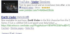
Now look what creeps into the SERP for [darth vader]:


There's a Google video result, about halfway down the first page. The video result would not be as highly ranked, except that Google's new US algorithm judged the video to be just as relevant as the 5th or 6th natural result. Then notice at the bottom:


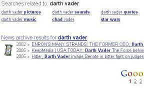
We've got news results at the bottom of the page as well, in addition to related searches that might be just as useful as the user's intended search phrase.

These are just a few examples to show what Google is striving toward - a truly comprehensive information search, that will let people from all demographics find the information they need, regardless of which search engine or portal they use. Eventually, if US becomes fully developed, people will no longer be limited to a certain type of information when they search. No longer will people need to go to JStor find scholarly publications, or to a news search for current events. After all, if a general search engine has so many categories it is limited from searching, how can it really be comprehensive?

Labels: , ,

17 May 2007

A few words about the new Google Analytics Beta Interface


I have to say that I am impressed with the overall functionality that Google has added with its new version of the Google Analytics interface, but it will certainly take me a while to warm up to it. It is definitely an improvement over the old interface, mostly because the new version better reflects the features that make other Google software good.


The only thing I really didn't like was the fact that the graph (pictured above) seems like it must show at least a month of data, no matter if you tell it to show only a week or a few days. Basically, it takes up the entire width of the screen, which makes it seem like they are devoting an awful lot of valuable screen real estate to the graph. It seems like they could have made it a quarter-screen module, and let you see another piece of info at the top of the screen. But anyway, it's annoying to me mainly because my blog has only been running for two weeks, so the first three weeks or so are zeros. Not a huge deal.

The best thing about the new beta is the added flexibility it grants the user. The user is able to add modules to the Dashboard easily, drag and drop them on the screen, and do other things that are reminiscent of the Google Home Page (oh yeah... it's called iGoogle, now that they admit it's a portal).

More commentary will come when I have time to write a proper post. I just wanted to get some words out there before dinner.

Labels: , , ,

Helping us get our Google on

Google just announced "Second Query" improvements to its search, to which I can only say, "awesome." The new improvements will launch a second query when a user performs a search, if it judges that the user could get more relevant results with a related (second) query. The SERP will then show the results of both queries, giving the user better results.

Perhaps more impressive are the new translation improvements, which will allow Google to translate a query into another language, find results, and then translate those results into the original query language to present to the user.

I think we know that the big wigs at Google and Yahoo are trying to build their search engines so that when grandma tries to search for "gold diamond ring," she gets exactly what she's looking for. It all depends on how they structure the SERP, but this is most likely going closer to that goal.

My question is, "what is this going to do to ad placement?" If you bought a top placement for the 1st query, will your placement be affected because Google judges that a 2nd query would have given the user what they wanted?

Conversely, what if you buy top placement for the 2nd query? Will your results get top billing now, or will the ones from the 1st query get to pull rank?

My gut says that the ads shown will be ones most relevant to the 2nd search. If Google has the opportunity to show ads that are more relevant, then I don't think they are going to pass it up.

Labels: , ,

15 May 2007

Google As Big Brother?

From the Search Engine Watch Blog...

Google Submits Patent for Psychological Profiling

Frank Watson at Search Engine Watch is really voicing his opinion in this post, claiming "it's all over," as Google ventures closer to becoming the incarnation of Big Brother.

Let me say first that this is an impressive new use of technology, and the only real surprise to it is that Google did not do this sooner. If it behooves them to know people's tendencies (obviously, it would behoove any marketer), and they are able to do this from using the existing technology, then how do we know they haven't already been doing this for some time now, and are just now submitting the patent for it? Perhaps they've been doing it with imperfect methods until now, and now that they've got everything down, they're trying to patent it. Makes sense to me.

However, this does come with something of a "slippery slope" realization. Is this the "slippery slope," from which it would be difficult - disasterous, even - to return? Remember our current dependence on foreign oil, as an example of another slippery slope, up from which it would be possible, but economically disastrous at our current point, to climb. Only when it is economically less feasible in the short run to continue in our current dependence on foreign oil and fossil fuels will be change course.

So, apply this to a Big Brother concept. Certainly, as the science fiction writer said, when and if we ever let ourselves me overtaken by our machines, we will quite possibly look back on the time when the takeover initially occurred, and recall that it happened so fast, and with so much initial advantage to us, that it was irresistible, and even unrecognizable, unanticipated. At that point, it will most likely be possible to revert, at least theoretically, but so costly and disadvantageous that to do so would be certain economic disaster.

Labels: , ,

14 May 2007

Don't Knock Wikipedia!

Nicholas Carr on how Facebook and Wikipedia might fit together

The above link is to popular author Nick Carr's article on how he thinks that, from a revenue standpoint, it would make sense for Facebook to imitate a Wikipedia website for the next addition to its network. This suggestion is on the heels of Facebook's announcement that it will launch a craigslist-like site to compete with the minimalist classified ad machine that gets most of its traffic from 20-somethings who are in college (i.e., likely Facebook users).

Of course, his idea makes sense from the point of view of Facebook's bottom line. At least, it does in the short run - the very short run. The problem is that, once the Facebook users, as young and self-involved as they are, realize that they are the only ones posting to the "Facebookpedia" (or "Wikiface" - I think that's a better title!). The wisdom of the crowd is only as good as the crowd from which it draws is big. The bigger the crowd, the more wisdom, obviously. Therefore, wisdom drawn from just 22-24 year olds won't grow near as fast or deep as the real wiki, which means that soon, the Facebook users will simply go back to using the same old Wikipedia, at which point Facebook risks losing its growth in popularity completely. An unimpressive venture that's really a copy of a very successful website would be detrimental for Facebook, in my opinion.

From a user-of-the-web standpoint, I'd also be worried if this idea is successful for Facebook. I personally love the site and the company - I think their open-source approach to their calling is great, and they've allowed themselves to branch out, to their benefit, creating the fastest growing network on the web. Such innovation benefits the cause of the web immensely as the forum for the free expression and flow of though. So, I'd be cautious about anything that might take away steam from something as beneficial as Wikipedia.

These are my humble thoughts. Any other opinions would be welcomed.

Labels: ,

10 May 2007

Check out the Web 2.0 Awards

Check out the Web 2.0 Awards, handed out by SEOmoz.

Labels: